Two years ago, I wrote an opinions piece titled “Repainted wall at Caf: gross affront to senses,” where I described my distaste for the objectively disgusting shade of purple that was imposed upon the now-defunct cereal section at La Cafeteria Commons. For those of you who remember the good ole days of Caf — when the glorious cereal section was in full operation and the finicky McDonalds ice cream machine was an exciting roulette game of chance — you may remember the shocking change to the back wall. It was as if Willy Wonka (Gene Wilder not Johnny Depp) strode in and vomited a gallon’s worth of candy-coated lavender spew across the surface.
Well ladies and gentlemen, imagine my surprise when, upon returning from my year abroad at St Andrews, I found an unassuming, un-hideous hue adorning that wall. No ugly asymmetrical rainbow carpets, just a plain and modest wall with normal chairs and normal tables — although the random black-and-white prints of European streets, where only the London double-decker buses or Parisian Citroens have any color, still remain. Whoever says that The Flat Hat doesn’t create change need only walk to the back of Caf — and thank yours truly.
So now I’m back in the ’burg, frolicking through the brick fields and enjoying myself, reveling in my single-handed defeat of the purple menace. Utter bliss. That is, until I decided to be studious and go work at Earl Gregg Swem Library. What I found before the door horrified my sensibilities beyond belief.
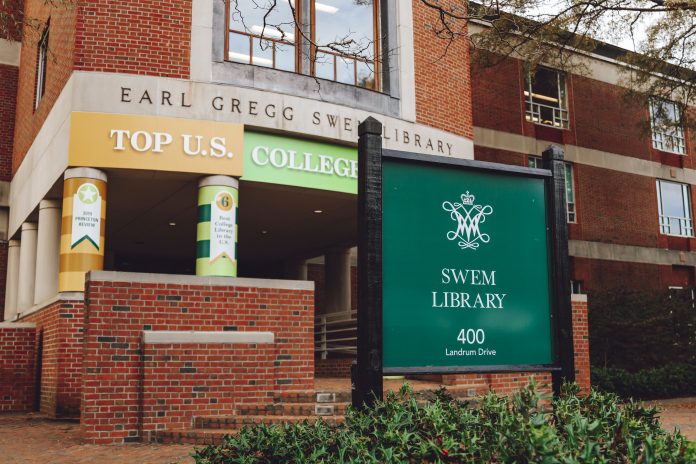
The bizarre candy cane paint job on the Swem facade is a disgusting rejection of good taste that brings discredit to our school. This revolting vanity project has proven that the agents of destruction and ugliness stop at nothing to achieve world domination. The paint job features a large block-letter banner reading “TOP U.S. COLLEGE LIBRARY” and the columns are plastered with “#6 Best College Library in the U.S.,” “2019 Princeton Review” and, very uninspiringly, “Based on Student Feedback.” It’s gaudy. It’s repulsive. Stepping into Swem makes me feel like I’m somehow implicated in this poor design choice, as if I was personally privy to the decision making, a co-conspirator. I half expect a platoon of oompa-loompas to come out of the stacks and drown me in a river of chocolate (the Willy Wonka metaphor strikes again).
Bad design is inherently combative to the senses. It’s a way of waging war on those who possess any semblance of taste. While the ignoramuses of the world may not notice poor taste, those of us who retain the use of our eyes find it tough to stay sane amidst such perils and pitfalls.
However, there is light at the end of the tunnel. For the interests of clarity and journalistic integrity, I decided to reach out to the library and get some additional information. My email sent at 12:31 a.m. was promptly answered a few hours later by a lovely staff member; she informed me that the facade was covered in a temporary vinyl wrap to celebrate the library’s placement on the 2019 Princeton Review list. More importantly, she said that the vinyl wrap is soon to be removed, and the pandemic delayed the scheduled demolition as library employees began working from home. She also told me that my email prompted her to get the removal process back into motion.
Justice prevails. The Flat Hat once again spurs on change with top-notch journalism and intrepid muck-raking. And considering that we’ve fallen to the #8 Best Library in the 2021 Princeton Review, I suspect that the vinyl wrap might not be repeated.
My initial cynicism had led me to believe that the Swem facelift was spearheaded by some silly bureaucrat working in the admissions office. My imagination ran wild, telling me that a boardroom full of professional bounty hunters, gunning for that sweet unlimited student debt money, had devised this vainglorious plot as a way to lure in more dollars. This led me to hate the project more than it deserved.
Instead, the Swem facade paint job seems to be a good-natured idea that arose from the library staff. Misplaced pride of the genuine sort is, I suppose, a much better alternative to self-interested vanity. Still, I will be glad to see the Swem facade returned to its former glory — bring back our dull brick and muted concrete, I say. Bring back what makes this school exceptionally great.
If you find anything else on this campus that merits an article-length tirade, feel free to email me at the address below.
Christian is a junior in the St Andrews Joint Degree Programme, majoring in English and minoring in economics. He is from Savannah, Georgia. Christian has worked as a copyeditor for The Flat Hat, Flat Hat Magazine and The Saint (in St Andrews); he is also involved with the Botetourt Squat. Christian is spending his last semester at William and Mary with his brothers in the Alpha Tau Omega house, a steep upgrade from his freshman-year GGV hovel. Though he’s whiter than Casper the ghost, Christian is a Brazilian-American dual citizen who proudly and semi-ironically calls himself a latino. Email Christian at cmborio@email.wm.edu.

