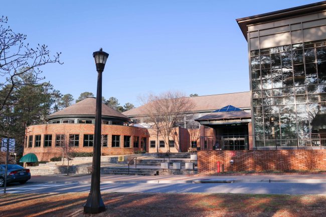
It’s that time of year again. Birds are chirping, flowers are blooming, the campus waits in anticipation for the arrival of the Crim Dell ducklings and tour groups are on the prowl. In many of these tour groups are alumni bringing their children to tour their alma mater. Needless to say, campus has changed a lot since they attended the College of William and Mary, but one of the most striking differences for many alums is the lack of lodges as they cross the terrace listening to the tour guides trying to pretend like Sadler food isn’t that bad. There was quite the uproar in The Flat Hat’s comments section and on the late Overheard at William and Mary Facebook page.
It’s not that any one building is completely abhorrent, but there is absolutely no consistency.
However, the destruction of the lodges gives tour guides another talking point — the College will build a new “Integrative Wellness Center,” which will house the Counseling Center, Health Center, Health Promotions and part of Campus Recreation under one roof. There is much to be said about this idea, but other people have said and will say all of that much better than I could. Instead, I would like to make a plea to whoever will be in charge of the architecture and interior design after the IWC is built: please do a good job.
The interior design of all of our campus’s buildings can best be described as eclectic. It’s not that any one building is completely abhorrent, but there is absolutely no consistency.
Morton and Jones were clearly modeled after the high school everyone is trying to forget. Blair looks like “Alice in Wonderland” meets the Ministry of Magic. Tucker looks like someone made two very nice buildings and then stitched them together using a baffling amphitheater. The newly unveiled Tyler looks like a cross between an airport and a Hyatt Place. The poor Campus Center is a mashup of an inner city middle school and your aunt from out of town’s church basement that you visited that one time.
No one can agree on which door to Blow is the front. The forest is constantly trying to take Botetourt back. The business school seems like its mission is to make you feel woefully underdressed no matter how dressed up you are. What is even the point of Tazewell? And I won’t even begin to get into the indie horror movie set that is One Tribe Place.
Putting aside the lack of consistency between buildings on campus, there is still a lack of consistency within individual buildings. Take Sadler Center for example.
Tidewater inexplicably combines the two aesthetics, seeming like a large conference center ballroom until you look up and see the exposed beams in the ceilings.
Any time parallels are drawn between your dining hall and the opposing sides of the Force, you might have a problem. The York and James rooms look like standard conference center rooms, aside from the promotional photos printed onto excessively blocky canvasses hanging on the walls. Chesapeake has kind of a ski lodge dance hall feel that hearkens back to the opening scenes of “High School Musical.” Tidewater inexplicably combines the two aesthetics, seeming like a large conference center ballroom until you look up and see the exposed beams in the ceilings.
Even the buildings that have more of an aesthetically pleasing and consistent design within them have flaws of their own. For example, Tyler is gorgeous, but you probably noticed that people still have plenty of classes in Morton. That’s because Tyler has a very limited number of classrooms, but Morton’s high school-inspired design has an incredible number of them. The new ISC is beautiful and has plenty of classrooms, but can anyone actually find their classes in that building? Since it’s clear that consistency between campus buildings is not a priority, for future construction and design, the College should find a way to balance aesthetics and functionality in a way that I’m not sure they’ve quite uncovered thus far.
If the architects and interior designers create a space that is aesthetically pleasing, easy to navigate and makes some semblance of sense, the IWC will be a great success and could be a bastion of hope for the College’s future construction projects. A major point of constructing the IWC is to bring the Counseling Center out of the shadows of Blow, but if the new building is just as hard to navigate, what’s the point?
Email Emily Chaumont at emchaumont@email.wm.edu.


Great article Emily, this was fun to read!