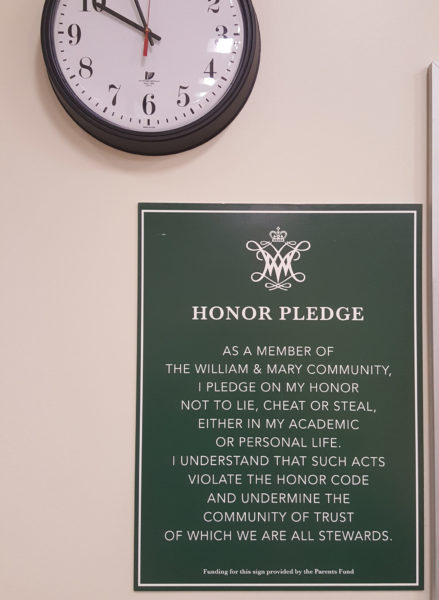
Last February, I wrote an impassioned — but tongue-in-cheek — critique of the signs displaying the Honor Pledge that had popped up in classrooms across campus.
The signs did not use the College-approved “William & Mary Green” — Pantone 343, #115740, if you were curious. They also inexplicably (and incorrectly) attempted to use title case to Capitalize The First Letter Of Every Single Word Of The Honor Pledge, even words like “the” and “of.” While the signs appeared to use the correct, College-approved Baskerville serif typeface and Avenir sans serif typeface, they used the sans serif for the “Honor Pledge” title and a strangely italicized version of the serif for the text of the pledge. Additionally, while I failed to mention this in my last column about the signs, several readers pointed out that the signs incorrectly stated that they were paid for by the “William & Mary Parent’s Fund” when it should be “Parents Fund,” sans apostrophe.
Over the past few weeks, new Honor Pledge signs have slowly been making an appearance in campus classrooms, replacing the signs put in last February. These signs have slipped into classrooms unnoticed by most, as the changes are subtle and they have been placed exactly where the old signs were. However, the changes did not go unnoticed by me.
Now, I don’t want to seem vain, but it seems to me like somebody read my February column, decided I knew a heck of a lot about design (for the record, I don’t, I was just staring at these signs too much when I was bored in class and thought it would be funny to write a column about how ugly they were), then took all of my suggestions into account and replaced the old signs with new, better looking ones.
To whoever thought my opinion was worth acting on: thank you. It will be easier to pay attention in class now that I won’t be constantly distracted by how hideous these reminders of the College’s commitment to honor are. Instead, I can now overlook these large signs just like every other student on campus.
Since someone is obviously listening, my next decree as self-appointed campus design master is to declare that there must be a standardized syllabus format all faculty must follow. No more of this odd font choice, weird capitalization or arbitrary underlining. From now on, all syllabi must be approved by a focus group of students to assure that they are legible and logical.
But seriously, while I consider it a personal victory that those hideous Honor Pledge signs have been replaced by ones that are far more aesthetically pleasing, I again have to question the funding behind the signs. Around $7,500 was spent on the first round of signs. I’m not sure how much was spent on this second round, but I guarantee you it was too much.
Next time we make a monetary commitment to something as important to the College’s brand as the Honor Code, we should make sure we get it right the first time.
Email Emily Chaumont at emchaumont@email.wm.edu.

