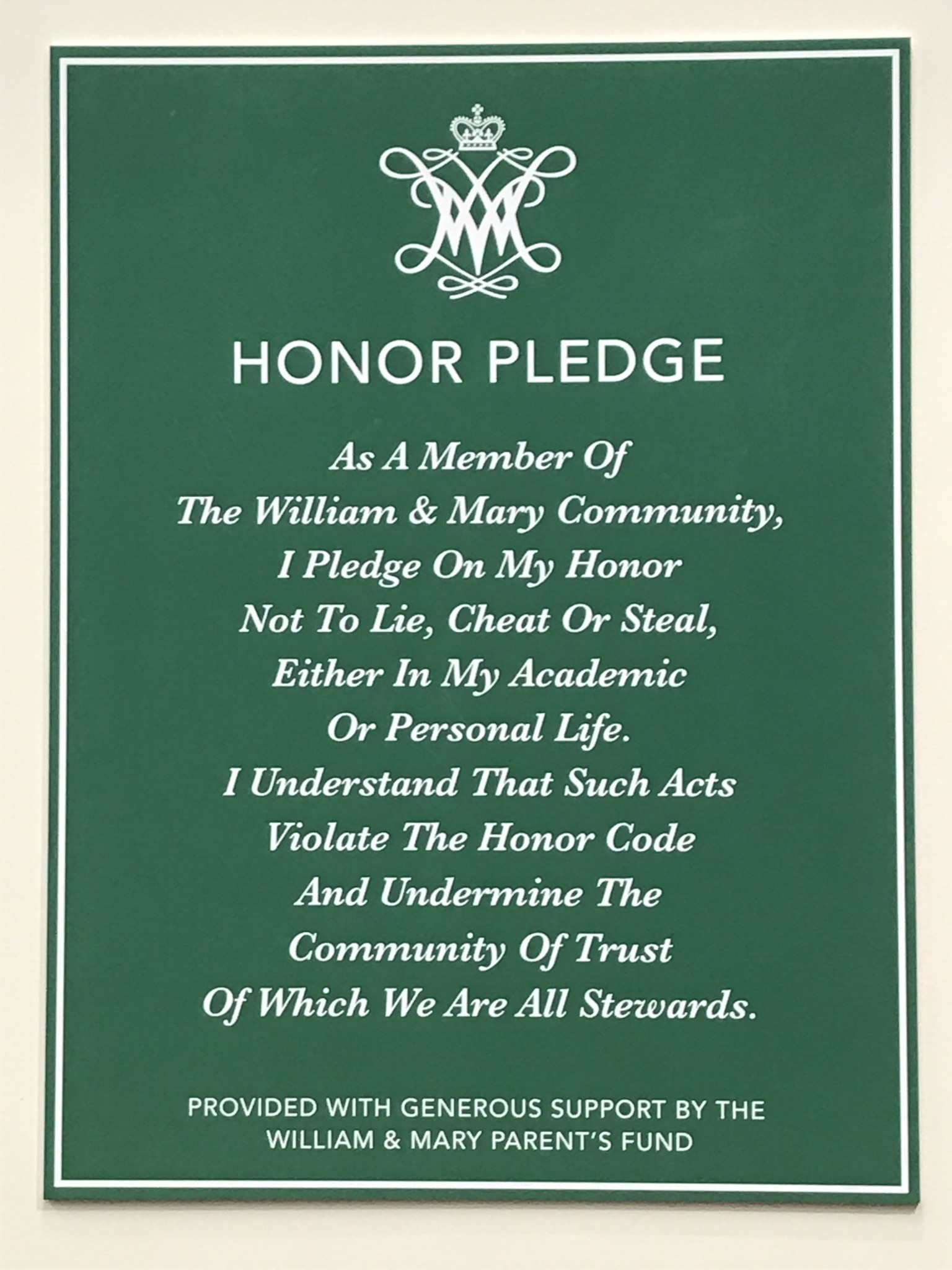
The past few weeks, students at the College of William and Mary may have noticed new wall decorations in their classrooms. Signs bearing the Honor Pledge now hang in every classroom on campus, and while the Honor Pledge certainly has a place in our academic buildings, these garish signs do not.
The signs were paid for by $7,500 allocated from the College’s Parents Fund, which is evidently used to fund a wide range of things, from a card reader at the Meridian Coffee House to student scholarships to these new, hideous signs.
The Honor Pledge is already included on most every syllabus students receive, and I’ve had to sign it alongside most of the exams and papers that I’ve turned in, so I’m not sure how effective of a reminder or deterrent having the wall sign really is.
Now whether these signs should have been funded at all is up for debate — the Honor Code is certainly an important symbol (and marketing tactic) at the College, but it seems to me that $7,500 is an awful lot to spend on a symbolic gesture. The Honor Pledge is already included on most every syllabus students receive, and I’ve had to sign it alongside most of the exams and papers that I’ve turned in, so I’m not sure how effective of a reminder or deterrent having the wall sign really is.
But that’s beside the point. I’ll let someone else debate the pros and cons of being constantly bombarded with a visual reminder of the Honor Code. The truth is, those signs don’t belong in the College’s classrooms because they are just plain ugly.
I’m not sure what shade of green the Honor Pledge signs are but they are certainly not “William & Mary Green.”
First off, as is clearly delineated in its style guide, the College has four official colors: “William & Mary Green” (Pantone 343), “William & Mary Gold” (Pantone 465), “Spirit Gold” (Pantone 7409) and “William & Mary Silver” (Pantone 427). I’m not sure what shade of green the Honor Pledge signs are but they are certainly not “William & Mary Green.”
The College’s official green is the dark, blueish, almost forest green that can be seen on signs and pamphlets across campus, as well all over the College’s website. The Honor Pledge signs, however, seem to be more of a yellowy green. Although the difference may not be immediately apparent, it is enough to make the eye uneasy. The College prides itself so much on consistent messaging that the fact that these Honor Pledge signs appear to be just slightly the wrong shade of green seems like a glaring mistake.
Title case refers to the sign designer’s incomprehensible choice to Capitalize The First Letter Of Every Single Word Of The Honor Pledge.
Even more glaring than the odd choice of green is the inexplicable use of title case in the honor pledge. For those unfamiliar with the term, title case refers to the sign designer’s incomprehensible choice to Capitalize The First Letter Of Every Single Word Of The Honor Pledge.
It is generally accepted that title case should only be used for telling your friend that they’re sporting A Good Look today and for actual titles of things — and I must point out, neither of those conditions are met with these signs.
Even if you choose to use title case, short words like “a,” “of” and “the” are generally not capitalized unless they’re at the beginning of the title. For some reason unbeknownst to man nor beast, the designer of these signs chose to capitalize the first letter of literally every single word of the pledge.
The combination of this unfathomable capitalization choice with the uncomfortable italics and queasy green background makes these signs truly a challenge to look at.
The combination of this unfathomable capitalization choice with the uncomfortable italics and queasy green background makes these signs truly a challenge to look at. I am in no way opposed to the College’s commitment to honor, but if $7,500 was going to be allocated to fund symbolic visual reminders of the Honor Code, they could at least have decided not to use title case.
Email Emily Chaumont at emchaumont@email.wm.edu.


You make good points about the use of title case and the odd color. You didn’t mention that it was apparently paid for by the “William & Mary Parent’s [sic] Fund”.
That’s the first thing that I noticed, too! Even if you’re going to add punctuation, it doesn’t take a William and Mary student to know that it would be “Parents’ Fund” – but it only takes 15 seconds to search and find that on the official WM website there is no punctuation at all (“Parents Fund”). Ugh.