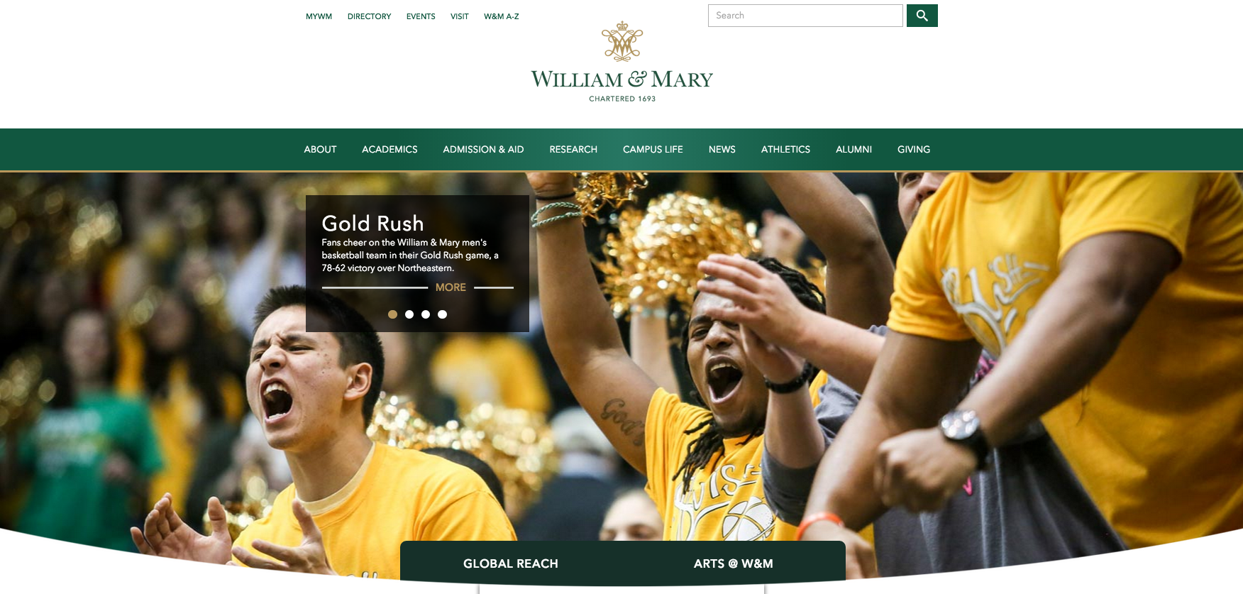
The College of William and Mary recently unveiled a redesigned website to better reflect the school’s new style guide.
“We knew the design of the university’s website needed to be addressed immediately to effectively represent the importance of our brand and visual identity,” Creative Services Director Tina Coleman said in an email.
Vice President for Strategic Initiatives Henry Broaddus said that the College’s Creative Services team handled the change completely in-house. Outside consultants and designers did not contribute.
“We wanted W&M’s website [to be] dressed in its finest in time for Charter Day, and the homepage has never looked better,” Broaddus said in an email.
In addition to the changes in appearance, the loading time for certain pages has improved.
The only cost of the project was the cost of securing rights to use the new web typeface, Avenir Next. This required a subscription based on the number of page views anticipated annually. The College pays $91.67 per month for the rights; the site receives between 20 and 25 million page views annually.
Associate Director of Design Justin Schoonmaker was the lead designer on the visual identity and web redesign projects. He said that the goals of the website remodeling were to employ official university colors into the primary web color palette and to provide a prominent place for the new university logo in order to gain recognition. The new site uses color contrast and white space rather than boxes and lines to distinguish between areas of content.
“We employ a team of award-winning designers in Creative Services that have a track record of producing excellent work, so we were confident we could execute the project in-house,” Schoonmaker said in an email. “As we started the redesign, however, several other opportunities presented themselves that then turned into major project goals. We realized we had an opportunity to ‘clean’ the site up by getting rid of superfluous lines, boxes and other dividing visuals.”
Schoonmaker also noted that the Creative Services team took advantage of current technologies in web programming and image optimization. The end result is a homepage that loads faster than the previous homepage on a mobile phone.
“The website is the first (and one of the most prominent) steps the university is taking to tie its visual communications into a single, cohesive look and feel,” Schoonmaker said. “This cohesion greatly affects the [recognition] of our marks, which in turn greatly affects the strength of our brand.”

